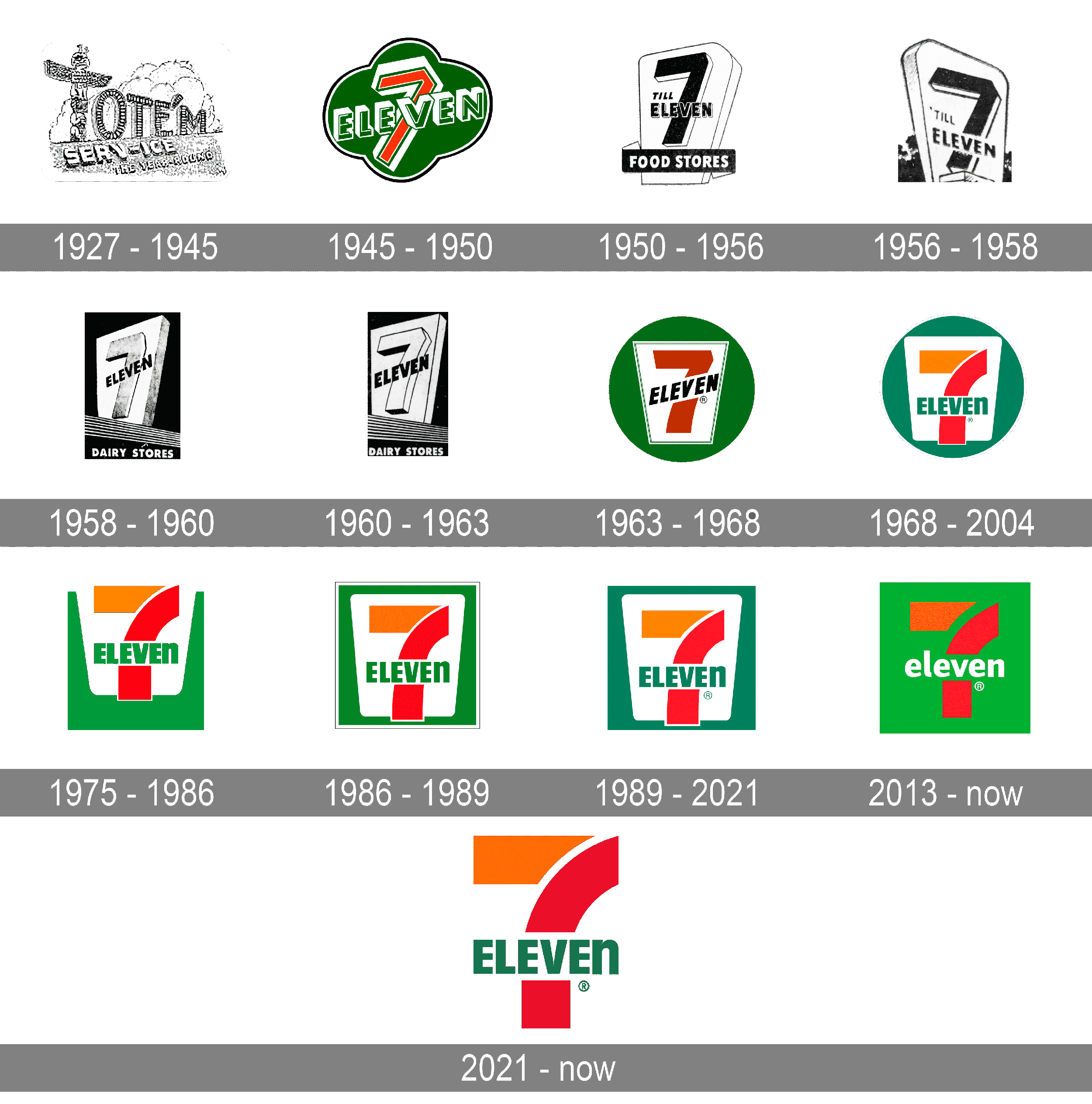
Everyone’s talking about the recent transformation of the Jaguar logo, but have you noticed how so many iconic brands have been quietly reinventing their logos over the years? From 7-Eleven to Instagram, Apple to Starbucks, the trend is clear: brands are moving towards simpler, cleaner designs.
🔍 What’s driving this change?
Simplicity helps brands create designs that are:
1. Memorable: A bold shape or clean font is easier for consumers to recall.
2. Versatile: Works equally well on a website, app icon, or billboard.
3. Timeless: Simplicity reduces the risk of looking outdated as trends evolve.
📚 In one of my Marketing Strategy classes at University of Toronto - Rotman School of Management, I learned that logos are not just visual identifiers; they’re emotional anchors. Brands focus on maintaining distinct colors, fonts, or design patterns that subconsciously remind customers of them—even when they’re not directly interacting with the brand.
Think of Instagram's vibrant gradient or Apple’s iconic silhouette. Even without the logos themselves, these design elements stick with you.
🚀 This shift isn’t just about aesthetics—it’s about creating lasting connections with customers.
What are your thoughts? Do you prefer these minimalist designs, or do you miss the intricate details of the older logos? Let’s discuss!
hashtag#MarketingStrategy hashtag#Branding hashtag#LogoEvolution hashtag#DesignThinking hashtag#CustomerConnection